GMC Logos
The main logo is GMC's primary sender and should be the default choice in most surfaces, especially in formal and operational contexts.
Use the main logo when the communication represents GMC as a group, or when there is no need to highlight an individual company.
The main logo is also suitable when space is limited. If necessary, the company or department can be specified as plain text in the header, footer or sender line.
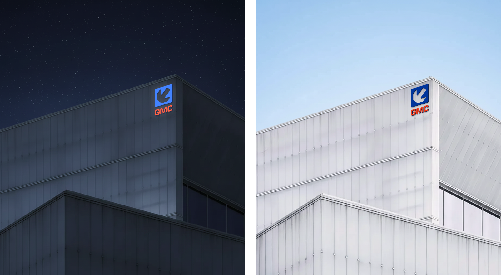
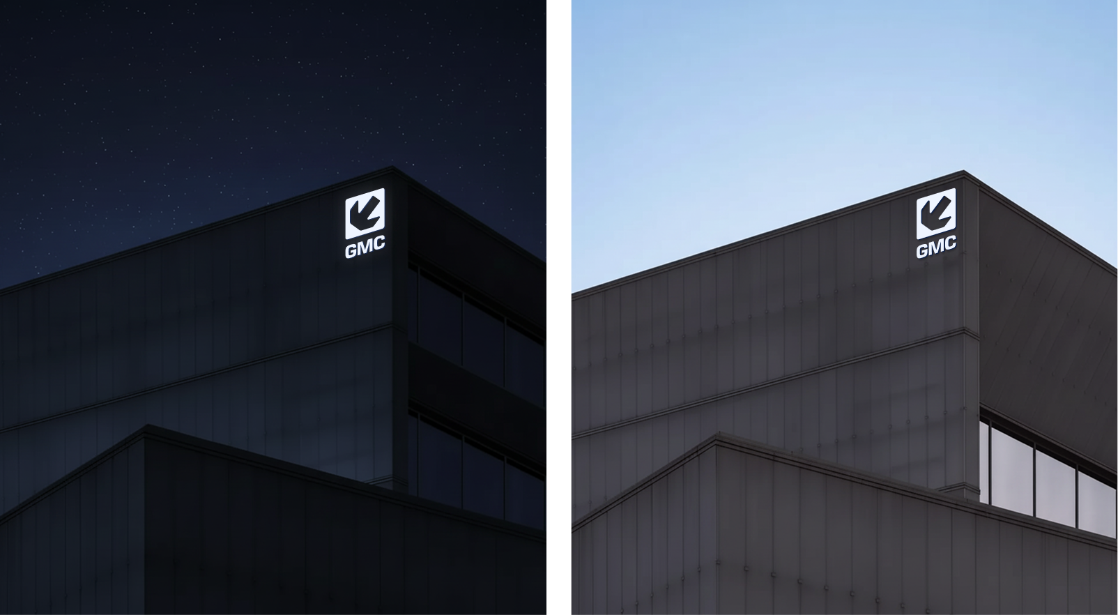
Choose logo variant based on background and contrast.
Main Logo
Default choice when the contrast with the background is good.
Negative Logo
Used on dark or distressed surfaces where the main logo is not clear enough.
Dark blue logo
Used for single-color printing on light backgrounds.
Main logo with badge
Used on photos or uneven backgrounds to ensure contrast.
Negative logo with badge
Used on photos or distressed backgrounds when a negative logo is needed.
Dark logo with badge
Used for single-color printing on photos or uneven backgrounds to ensure readability.
GMC Company Logos
Company logos are used when the communication is about a specific company, and you want this company to be clearly the main sender and be in focus.
This applies in particular to tenders, offers, contracts and other documentation.

Main logo

Main logo negative

Main logo alternative
Tone of Voice
The language should be concrete, competent and neat. GMC is an experienced and solution-oriented supplier, and this should be noticeable in the way we communicate. We write simply, but never simplistic.
Main principles:
- We are direct and clear. Sentences should be short, clear and easy to understand.
- We demonstrate professional weight through structure and precision, not through claims or marketing phrases.
- We appear confident and solution-oriented. The customer should feel that we are in control.
- We use active language. Verbs that plan, execute, follow up, and deliver provide momentum and authority.
- We avoid exaggerations. No adjectives like best, leading or unique.
- We use lists and sections that make it easy to scan the content and understand the services.
Example:
Instead of: We are a flexible and reliable player with extensive experience
we write: We adapt to the operation and deliver what is needed at the agreed time.
Minimum air clearance
There should always be sufficient air around the logo to ensure good readability and a clear message. The logo has a defined protected area that should be free of text, graphics and other visual noise.
The minimum air gap is based on the height of the nameplate and scales proportionally to the size of the logo. The principle applies to all logo versions.
When multiple company logos are placed next to each other, they should have the same height of the name text and always maintain a minimum air gap around each logo, with a clear distance between the logos so that they do not feel squeezed or overlap in the protected area.


Profile colors
The profile colors for GMC are divided into GMC Industry and GMC Property. Black/dark palette is used for both.
GMC Industry
Dark blue
#0C1F49
Blue
#00359C
Light blue
#1B80E5
White-blue
# EEF4FF
Property
Dark red
#490C0C
Red
#841814
Bright red
#F33B18
Radish
#FFEEEE
General
Black
#030508
Gray
#303439
Light gray
#768699
Light gray
#C8D2DC
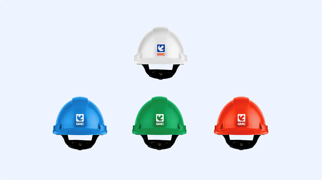
Logo use on helmet
The size of the logo must be adapted to different helmet models and manufacturers so that the logo is on an even and visible surface. On light helmets, the full-color version is used, on colored helmets, a full-white version is used to ensure good contrast.
White helmet: Standard helmet
Red Helmet: Supervisors/Foremen
Green helmet: Safety representative
Blue Helmet: Crew and Visitors
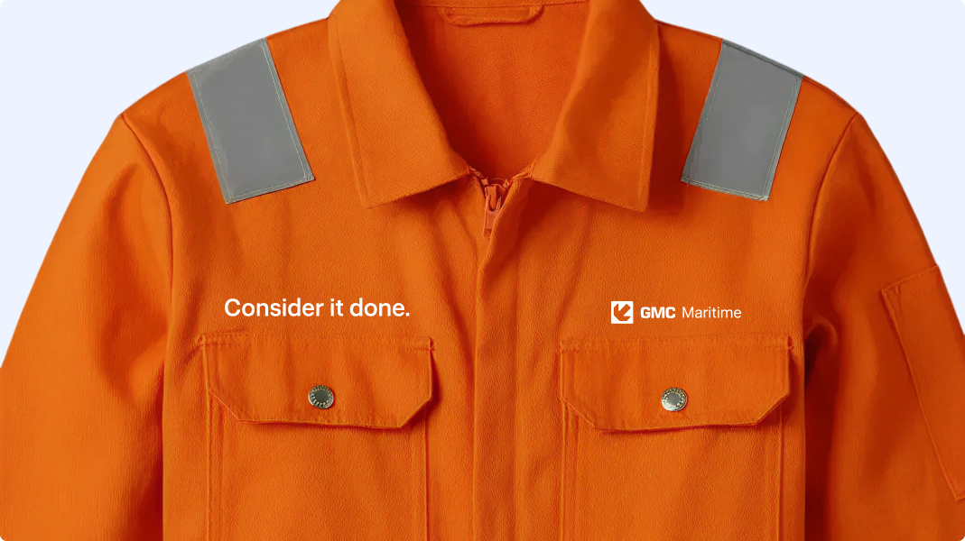
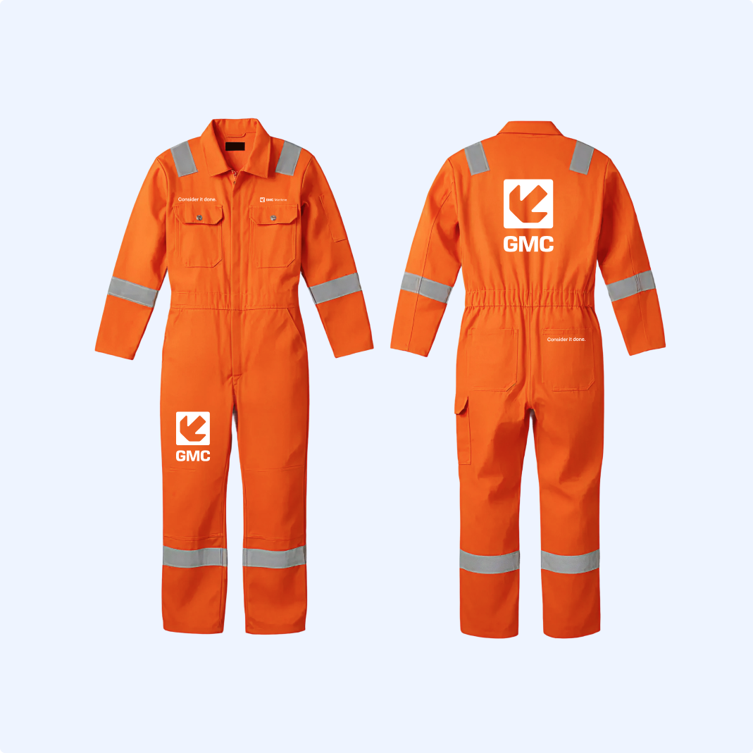
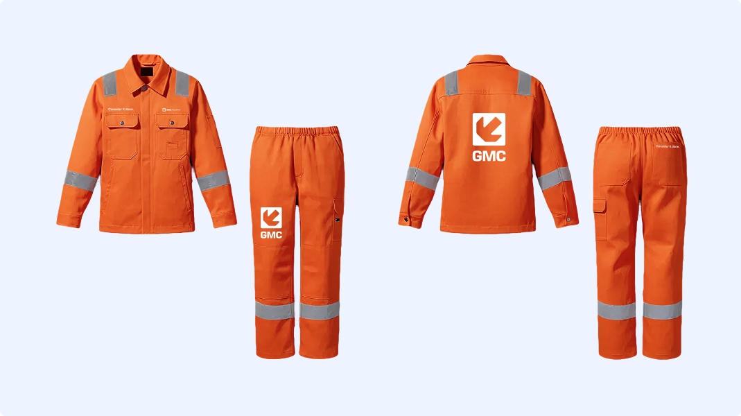
Profiling on workwear
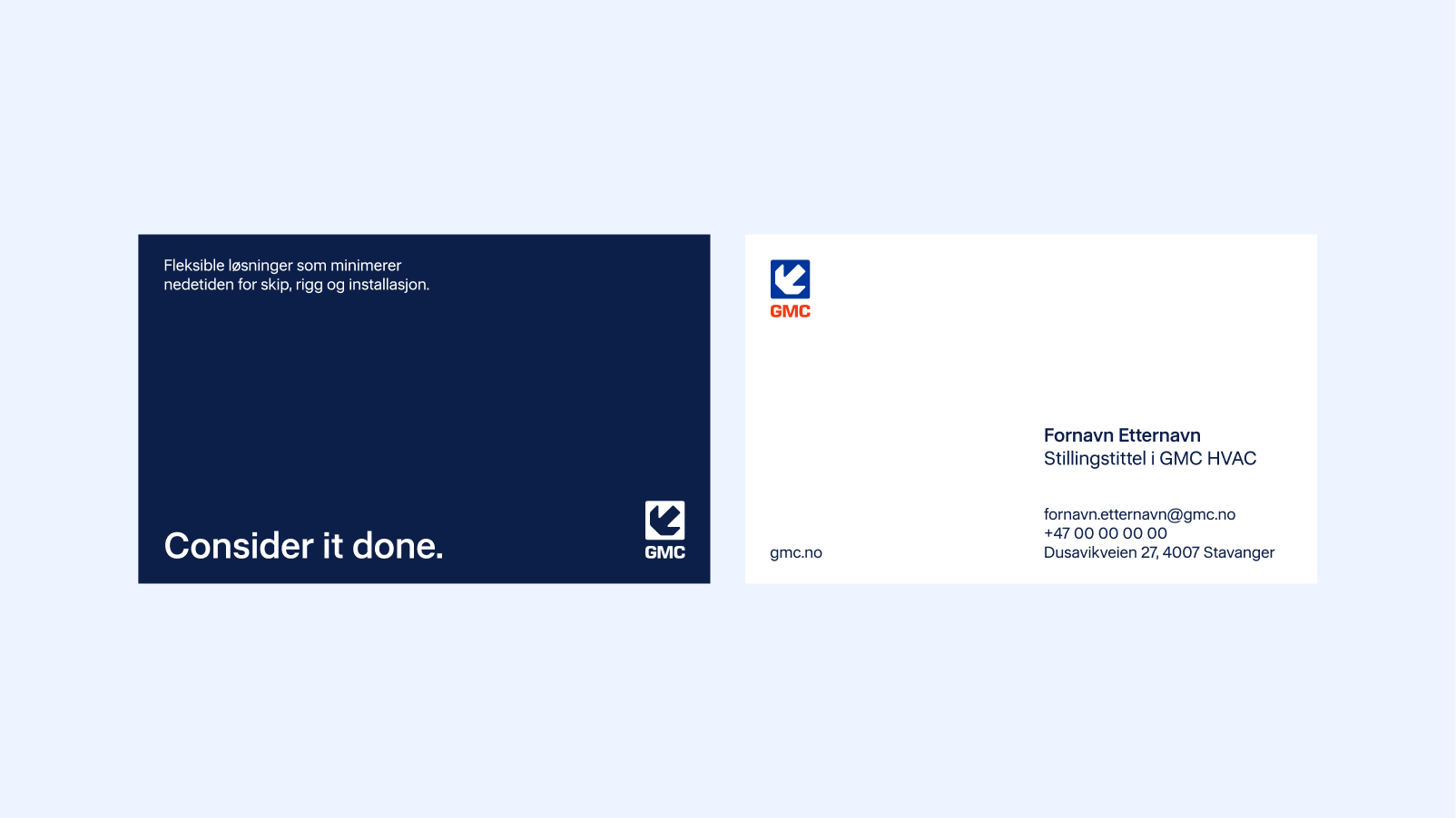
The GMC company logo should be centered above the breast pocket, with enough space around it to expand for companies with longer names. “Consider it done.” is centered on the opposite chest.
On pants, the GMC logo is placed on the left thigh and "Consider it done." on the right back pocket.
On jackets and overalls, a large GMC logo is placed in the middle of the upper back. Reflective details are kept as they are.
"Consider it done." and logo can be moved to accommodate pockets or other cuts on workwear.
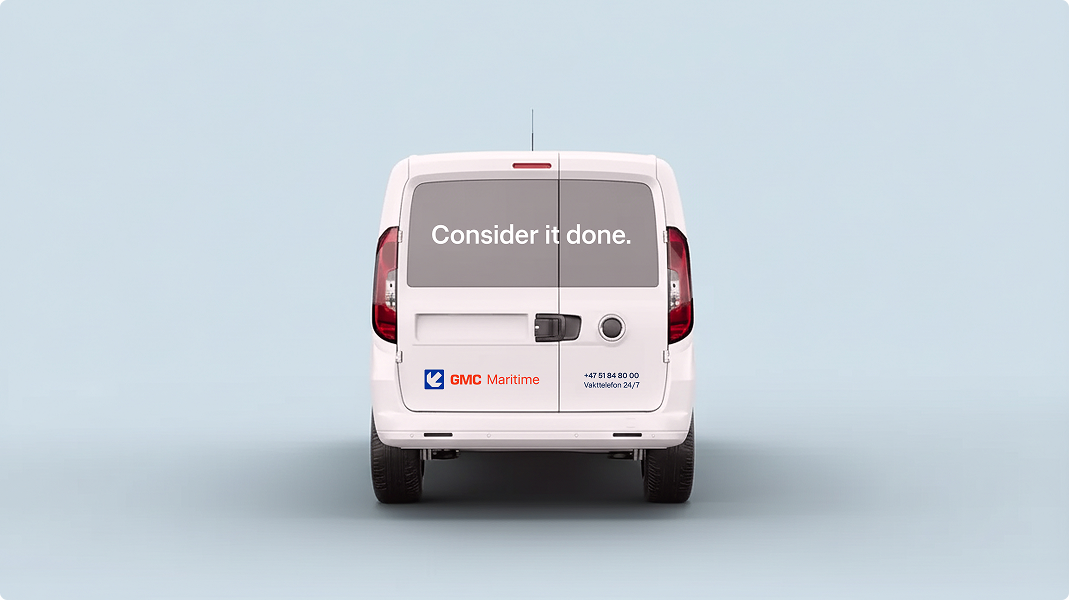
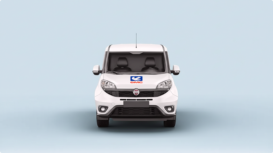
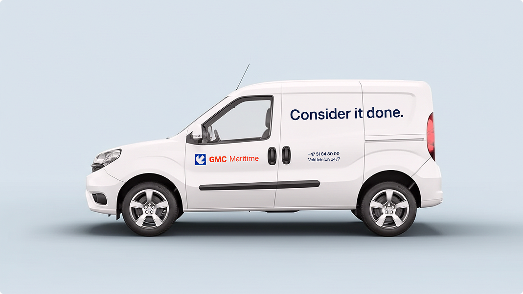
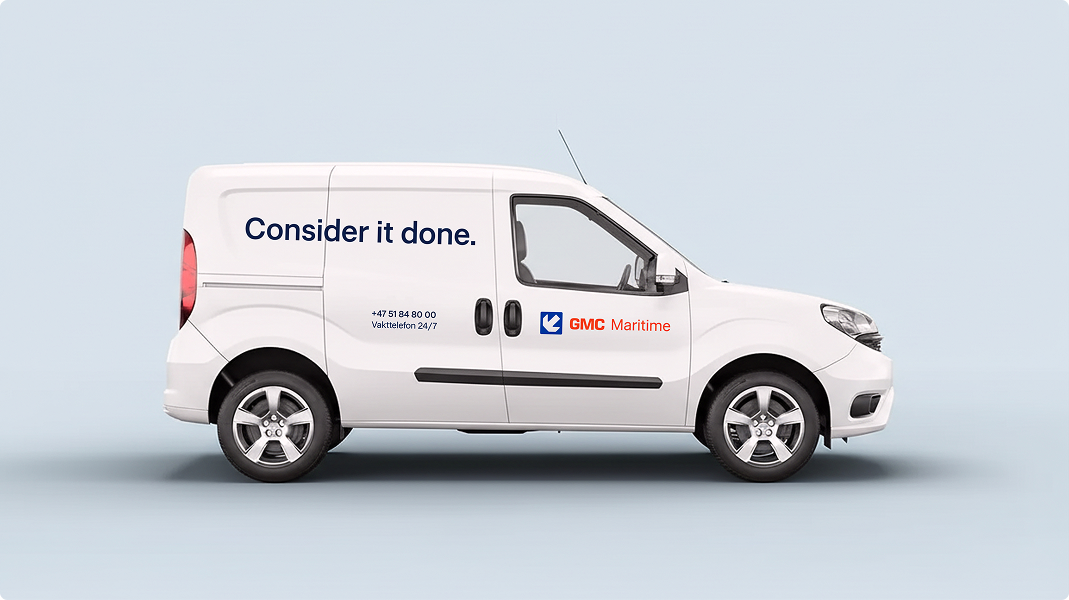
Car decoration guidelines
The GMC logo is centered on the front hood.
On the sides, “Consider it done.” is written in large letters on the rear side panel. The GMC logo with the company name is placed on the front door, while the phone number and “24/7 emergency phone” are grouped together below on the side panel.
The locations should be mirrored equally on both sides, centered in available areas and adapted to the car model.
At the back, “Consider it done.” is written in large letters in the rear window, with the GMC company logo and name (e.g. GMC Maritime) at the bottom of the left rear door and the phone number with “Emergency telephone 24/7” at the bottom of the right rear door. Text on the window should always be white.
Headings
Restart hard Medium
Body
Lorem ipsum dolor sit amet, consectetur adipiscing elit, sed do eiusmod tempor incididunt ut labore et dolore magna aliqua. Ut enim ad minim veniam, quis nostrud exercise ullamco laboris nisi ut aliquip ex ea commodo consequat. Duis aute irure dolor in reprehenderit in voluptate velit esse cillum dolore eu fugiat nulla pariatur. With over 50 years in the industry, we deliver solutions that keep the wheels turning. From maritime service and automation to property development and infrastructure - we solve the task and ensure quality at every stage.
Icons

Maritime ship service

Docking

Electrical and automation

Ventilation and cooling
Lifting and transport equipment

Base services

Marine operations

Naval services
Examples of using icons

Examples of surfaces
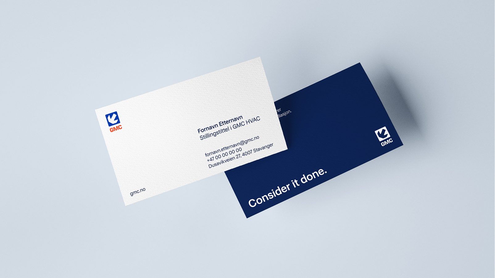
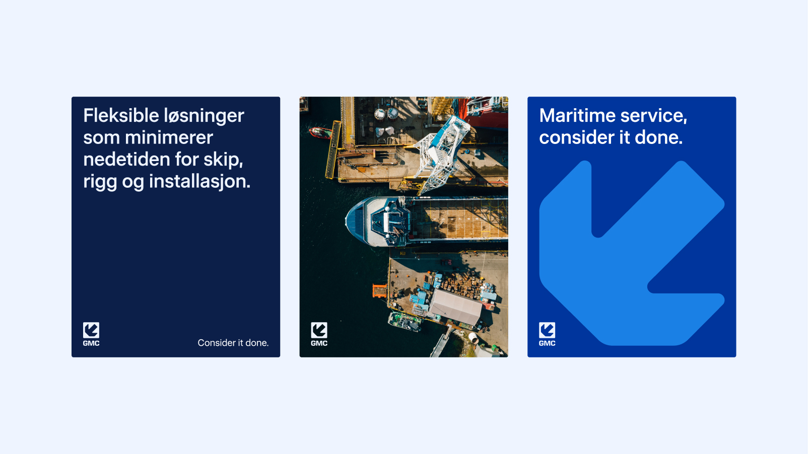
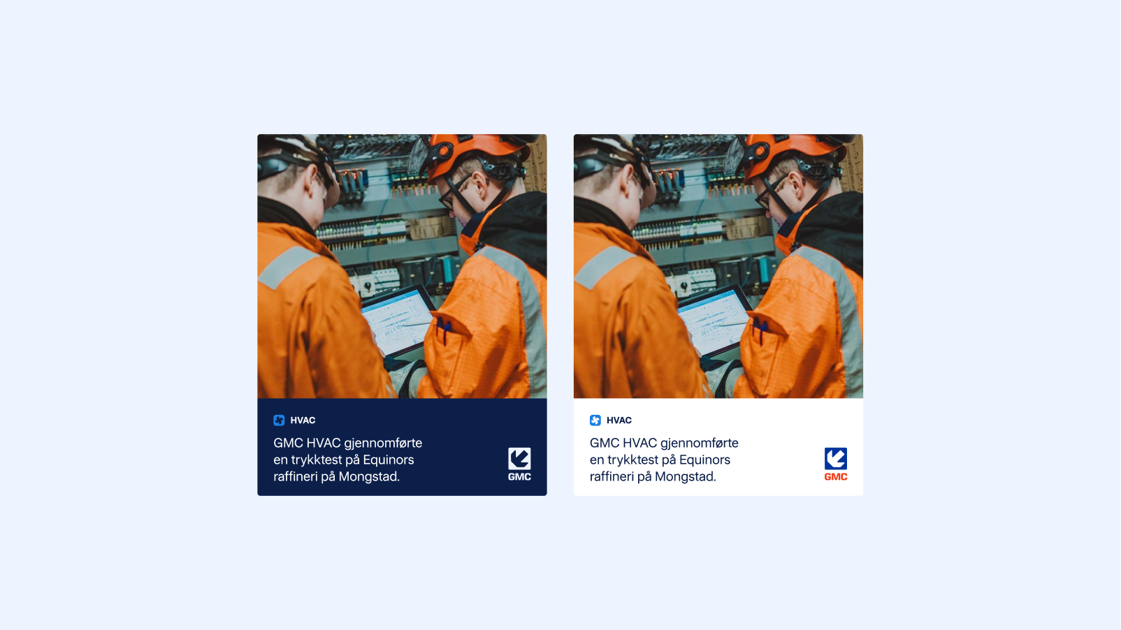
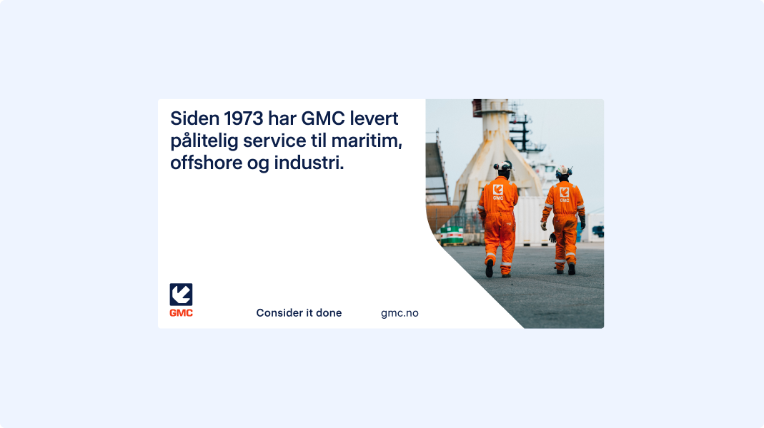
Below are examples of profiles on different surfaces and in different contexts.
.png)